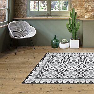
The trending colours for cement tile floors are muted greens (sage and olive), deep blues (Mediterranean, petrol and cobalt), terracotta and warm neutrals — cream, sand and taupe — with bright accents in small doses. Black and white has never gone away. They all come from the same colour chart, MC1 to MC49.
What has changed is not the range but the dose: floors in full colour from edge to edge have given way to neutral bases with the colour concentrated in the pattern.
What are the trending colours for cement tile floors?
Muted greens, deep blues, terracotta tones and warm neutrals. Trends move slowly in flooring that lasts for decades: the palettes laid in 2025 are still current, with green gaining ground on grey. These are the six families that come up in most projects.
| Palette | Specific shades | Goes well with | Where it works best |
|---|---|---|---|
| Greens | Sage, olive, aqua green, emerald | Light wood, brass, off-white, terracotta | Kitchens, bathrooms, courtyards |
| Blues | Mediterranean blue, petrol blue, cobalt, indigo | Limewash, white, light wood, glazed ceramics | Bathrooms, kitchens, entrance halls |
| Terracotta and earth tones | Terracotta, roof-tile red, apricot, sienna | Fired clay, dark wood, iron, linen | Living rooms, country houses, verandas |
| Warm neutrals | Cream, sand, bone, taupe | Any bright accent and coloured furniture | Small flats, corridors, phased renovations |
| Black and white | Chequerboard and two-tone geometric designs | Steel, marble, straight-lined furniture | Entrance halls, commercial spaces, bathrooms |
| Greys and pastels | Pearl, mid grey, pale pink, mist blue | Oak, linen, muted tones | Bedrooms, circulation areas |
Greens: the family on the rise
Green cement tile floors have gone from a rarity to a regular request, and the trick lies in the shade. Muted greens — sage, olive, grey-green — behave like a neutral and sit happily with any furniture; emerald and bottle green work better as the secondary colour in the pattern. In kitchens with light wood and brass, a mid olive green is the safest bet.

Blues: from Mediterranean blue to petrol blue
Blue is the colour with the longest history in the cement tiles of southern Spain: with white limewash and light wood, it creates a Mediterranean feel on its own. Mid blues and indigo offer plenty of scope in bathrooms; petrol blue and cobalt call for light walls because, over a large area, they absorb a lot of light.
Terracotta and earth tones: understated warmth
Terracotta is both a material and a colour name: it refers to the reddish orange of fired clay and, as a pigment, carries over unchanged to the cement tile. It is the range that goes best with fired-clay floors, beams and dark wood; in its softer version — apricot, rosy sand — it makes a warm base for green or blue accents.
Black and white: the classic that never drops off the list
Chequerboard and two-tone geometric designs are still the most requested for entrance halls and commercial spaces, and it is not nostalgia: high contrast brings order to a space. There are more ideas in our article on the comeback of black and white tiles.
What mood does each colour bring to a floor?
The colour of the floor sets the temperature of a room before the walls do, because it is the largest continuous surface in view. Cool colours calm, warm ones draw you in, light ones make the space feel larger and dark ones add depth.
- Blues and greens: serenity. They suit places with water or where you want to rest: bathrooms, bedrooms, courtyards.
- Terracottas, mustards and reds: energy and a welcoming feel. They work well in dining rooms and kitchens.
- Yellows and apricots: brightness. They rescue inward-facing rooms or those with north light.
- Light shades (cream, bone, pearl): spaciousness. In a narrow corridor they make it feel wider.
- Dark and saturated shades: depth, but they show pale dust and footprints more. Best as an accent.

How do you combine a colourful cement tile floor with walls and furniture?
The basic rule: only one star. If the floor has pattern and colour, the walls, joinery and furniture take a step back. If it is plain or softly patterned, you can afford a wall with character.
- Three colours at most: the dominant one on the walls, the floor colour and an accent in textiles or joinery.
- Take the wall colour from the pattern itself: pick a secondary shade from the tile and carry it onto the wall in a softer version. It is the quickest way to make everything come together.
- Skirting: cement tile skirting in the background colour of the tile finishes the floor without breaking it up; in white, it creates a clean line between floor and wall.
- Don’t repeat the pattern on the wall. If the floor has a geometric pattern, the wall tiles are better plain or textured.
What gets overlooked most is the transition from one room to the next. When a cement tile floor meets wood, microcement or terracotta, the change is resolved at the threshold with a metal profile or a finishing row of tiles, never halfway across a room.
Does a neutral base with bright accents work?
Yes, and it is the go-to formula when you want colour without overdoing it. The idea is to treat the floor as a composition: the neutrals are the background, and the intense shades are flashes that guide the eye. There are two ways to do it.
Colour within the pattern. Choose a design with a neutral motif — off-white and grey, for example — and let the intense colour appear only in the fine lines or the flowers: petrol blue, emerald green, mustard. The floor has character, but in small doses, almost like embroidery.
Tile rug or frame. The main floor is laid in plain tiles or a very subtle pattern, in cream or grey, and a more colourful panel is set in the centre. It works to frame the dining table, mark the entrance or define the island in an open-plan kitchen. More examples in our guide to cement tile rugs.

Three combinations that almost always work: off-white and pearl grey with navy or petrol blue; beige and sand with terracotta or mustard; cream with sage green and light wood.
How do format and grout change the colour?
The same colour reads differently depending on the size of the tile, because the proportion of joint changes: the smaller the format, the more grout there is per square metre and the more its colour counts in the final look.
| Format | Ref. | Size | Weight | Pcs/m² | How the colour reads |
|---|---|---|---|---|---|
| Square | H02 | 25 × 25 × 1.8 cm | 2.30 kg/pc | 16 | Large patterns, few joints and very continuous colour |
| Square | H03 | 20 × 20 × 1.5 cm | 1.30 kg/pc | 25 | The benchmark format: a balance between pattern and joint |
| Square | H04 | 15 × 15 × 1.5 cm | 0.79 kg/pc | 45 | Visible grid; mid tones gain texture |
| Square | H06 | 10 × 10 × 1.5 cm | 0.35 kg/pc | 100 | Lots of joints: the grout counts as much as the colour of the tile |
| Hexagonal | H21 | 30 × 20 × 1.7 cm | 1.62 kg/pc | 21 | Ideal for single colours and zoned gradients |
| Chakar | H61 | 20 × 17 × 1.5 cm | 0.58 kg/pc | 50 | The shape takes the lead: best with two or three colours |
| Tile insert | H07 | 7 × 7 × 1.5 cm | 0.25 kg/pc | 205 | A dot of colour scattered among terracotta or terrazzo |
The full table is on our cement tile formats page. One example of a format where geometry takes precedence over pattern is the Chakar cement tile, at 20 × 17 cm and 50 pieces per square metre.
Grout is the colour decision most often made on the spot. A cement-grey grout is the neutral option; a white one raises the contrast and picks out every tile; a dark grey one unifies the whole floor and mutes the pattern. Because cement tiles are laid with minimal joints, the effect is subtle in large formats and decisive at 10 × 10. A site tip: with light shades it is worth sealing before grouting so that the grout pigment does not stain the porous edges. We go into more detail in our guide to choosing grout to suit the colour of your tiles.
Why doesn’t the same colour look identical on every tile?
Because a cement tile is not printed: it is pressed. The pigment is mixed with cement and marble powder in a face layer several millimetres thick, and each tile is filled by hand, mould by mould. That is where its depth of colour comes from, and also the variation in shade between tiles and batches, which is more noticeable in single-colour tiles because there is no pattern to distract the eye.
How to manage it on site:
- Order the material for the whole job in one go, so that it all comes from the same production run.
- Mix the boxes before you start, taking tiles from several at once.
- Dry-lay a section before fixing anything: it is the last moment when you can change your mind at no cost.
- Keep spare material; a new batch made a few years from now will not necessarily match in shade.
- Judge the colour dry, because a wet tile looks much more saturated than a fully cured one.
That last point also applies to treatment: a water-repellent impregnator intensifies and slightly darkens the shade, and wet-look products do so very visibly. Test it first on a spare tile. The full chart is on our page of cement tile colours, MC1 to MC49.
Which colours hold up best outdoors and under heavy foot traffic?
Colour does not determine durability: the material, the finish and the treatment do. A green and a cream from the same catalogue behave the same way when it comes to slip resistance or frost. What does change is what you see: very dark shades build up more heat in the sun and show lime efflorescence more, while patterned mid tones hide sand and footprints better.
The hard data comes from laboratory tests. Our 20 × 20 cm hydraulic terrazzo achieved a PTV of 59.5 in the wet pendulum test at 20 °C, which puts it in class 3: the top of the scale and the class that Basic Document DB-SUA 1 of the Spanish Building Code (CTE) requires for outdoor areas, showers and swimming pools. This is recorded in test report no. 4718. Cement tile has its own report, no. 9102, under UNE-EN 1339:2004 (the Spanish version of EN 1339), on the 200 × 200 × 15 mm format.
| Product | Mean water absorption (E) | Method | Report no. |
|---|---|---|---|
| Hydraulic terrazzo 20 × 20 cm | 5.9 – 6.2 % | UNE-EN 13748-1 | 4718 |
| Glazed zellige 10 × 10 cm | 15.7 % | UNE-EN ISO 10545-3 | 9103 |
| Terracotta 15 × 5 cm | 16.9 % | UNE-EN ISO 10545-3 | 7539 |
To put the figures in context: porcelain stoneware stays below 0.5 %. Terracotta and zellige are porous by nature, which is why they are always treated with a water-repellent. The reports are signed by Elabora, a laboratory registered with the Andalusian regional government (Junta de Andalucía) under number AND-L-155, and can be downloaded in full from our laboratory tests page.
How do you choose the final colour without getting it wrong?
Order matters: first what you are not going to change, then the role the floor plays, and only at the very end the reference from the chart.
- Pin down what is fixed: worktop, joinery, doors, bathroom furniture and the adjoining floor. The colour is chosen against those, not in a vacuum.
- Decide whether the floor is the star or the backdrop. If it is the backdrop, go for a warm neutral and save the colour for the pattern or a central rug.
- Narrow it down to two or three references and ask for physical samples: no screen can reproduce a mineral pigment.
- Look at them in place, resting on the floor and at different times of day, in daylight and with the lights on.
- Check format and availability: see which designs are available among our cement tiles in stock and ask the workshop about lead times and minimum orders.
Frequently asked questions about cement tile floor colours
Which cement tile floor colour is most popular right now?
Muted greens and deep blues are the shades that have grown most, followed by terracotta. Alongside them, there is strong demand for neutral bases — cream, sand, taupe — with the colour concentrated in the pattern. Black and white is holding firm in entrance halls, commercial spaces and bathrooms.
Is terracotta a colour or a material?
Both. Terracotta, or fired clay, is a ceramic material made from baked clay, and terracotta is also the characteristic reddish orange of that clay. When people talk about terracotta cement tiles, they mean the colour: the pigment reproduces the shade in a tile of pressed mortar.
How do I combine a colourful cement tile floor with the walls?
Let the floor be the star and tone down everything else: walls in off-white, cream or light grey. If you want a coloured wall, take the colour from a secondary shade in the tile pattern and apply it in a softer version. Don’t repeat the geometric motif in the wall tiling.
Do you have green and blue cement tiles in the catalogue?
Yes. The cement tile colour chart runs from MC1 to MC49 and includes several greens and blues, to use as the only colour on plain tiles or combined within a pattern. Write to us with the design and the room, and we will tell you what is available in each format.
Does the colour of cement tiles fade over time?
The pigment is mixed into the face layer, several millimetres thick, rather than printed on the surface, so foot traffic does not wear it away as it does with a printed decorative film. What dulls the colour is usually something else: dirt, detergent residue, limescale or an ageing sealer.
Can I order a colour that isn’t on the chart?
The MC1–MC49 chart is the starting point, and the leeway depends on the pigment and the design, so it is assessed case by case with the workshop. In our article on custom cement tiles we explain how a bespoke design is developed and what information is needed.
The next step is to hold the colour in your hand: the chart points the way, but the sample resting on your floor is what decides. Tell us the room, the square metres and the format, and we will tell you which references are available from our workshop in Seville.